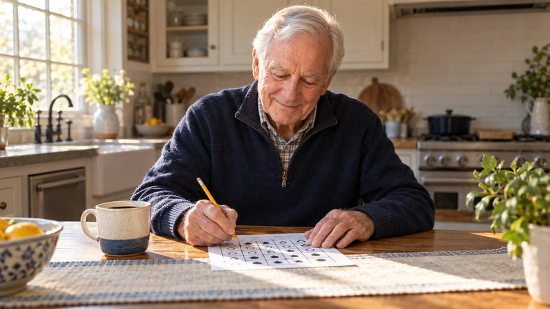
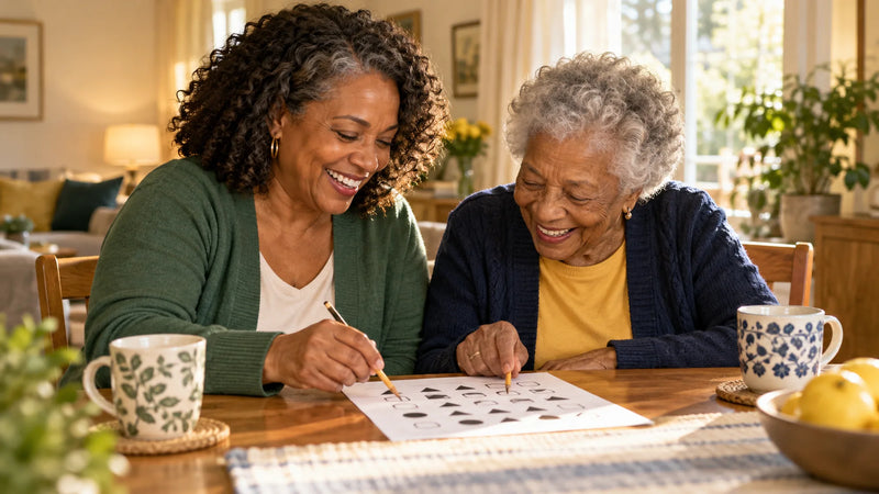
If you've ever handed a parent a puzzle book and watched them squint, tilt the page and give up after five minutes, you know that print size can make or break an activity. The good news: a few simple features make a big difference.
1. Size: 18 point is the starting line
Most large-print guidelines treat 18-point type as the minimum for "large print," and the American Council of the Blind recommends 20 point. Text at 14 to 16 point is often sold as large print, but it's really just enlarged. For instructions and answers your loved one needs to read, look for 18 to 20 point or more.
2. Letter shapes that can't be confused
Size isn't everything. Some fonts make the capital I, the lowercase l and the number 1 look almost identical, or turn 6, 8 and 9 into blobs. Readability-focused typefaces have wide letters, open shapes and clearly different characters. One example is Atkinson Hyperlegible, a free font developed by the Braille Institute specifically for low-vision readers.
3. Strong contrast, light color
Dark text on white or very light paper is easiest to read. Avoid pages with text on top of pictures, pale gray instructions, or bright backgrounds. A little soft color is fine for decoration, but the text should always be dark and solid.
4. Space to breathe
Crowded pages are tiring. Look for generous margins, extra space between lines, and only one clear instruction per page. Writing space matters too: lines and boxes should be big enough for handwriting that may be larger or less steady than it used to be.
5. One task per page
A page that mixes three different puzzles forces the reader to keep switching. A single activity with one instruction at the top is calmer and easier to finish, and finishing is what makes people want to do another one tomorrow.
6. Print it right
- Use the "Actual size" or "100%" setting. "Fit to page" can shrink everything by several percent.
- Black and white is fine. Well-designed pages read clearly without color, which saves ink.
- Choose matte paper. Glossy paper reflects lamp light. Regular printer paper is ideal.
- Use a soft pencil. A 2B pencil writes darker with less pressure than a standard HB.
7. Light the table, not the room
Even the best page is hard to read in dim light. A lamp aimed at the table, or a seat next to a window during the day, often helps more than bigger print.
A quick checklist
- Instructions at 18 point or larger
- Clear font with distinct letters and numbers
- Dark text on a light background
- One activity and one instruction per page
- Room to write
- Answer key included
If a page passes these checks, it's much more likely to become a daily habit instead of a frustration.
If reading has become much harder recently, or vision changes suddenly, book an eye exam. Untreated vision problems are worth checking at any age.
Sources
- Large-print size recommendations (APH, ACB, NAVH) summarized in large-print guidelines.